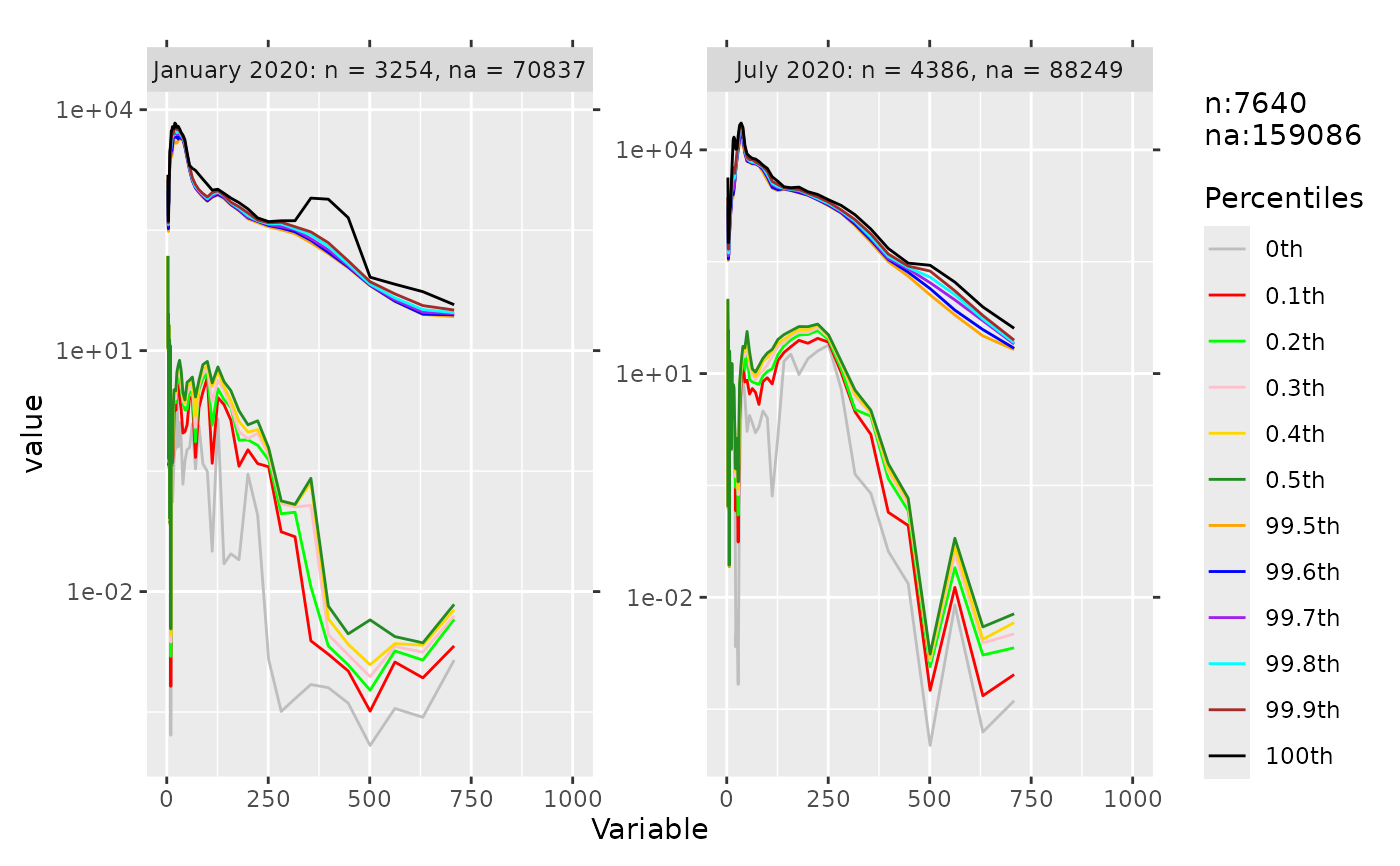
Plot top and bottom percentiles of selected variables
percplot.RdPlots percentiles computed by percdata using ggplot2.
Usage
percplot(data, cols = NULL, group = NULL, diff = 0.1,
         part = "both", ncol = NULL, num_xaxis = "auto",
         verbose = FALSE)
Arguments
- data
A data frame.
- cols
Column indices or names of numeric variables.
- group
Grouping column.
- diff
Difference between quantile probabilities.
- part
Which part to plot:
"both","bottom", or"top".- ncol
Number of columns in facet layout.
- num_xaxis
How to treat numeric column names on the x-axis.
"auto": use"log"if column names are numeric and evenly spaced on a log scale with a range ratio >= 1000, otherwise keep them as factor levels."log"or"numeric": force the corresponding scale."character","factor","keep", orFALSE: keep as character/factor.- verbose
Logical; if
TRUE, prints timing message.
References
1. Example data is from https://smear.avaa.csc.fi/download. It includes particle number concentrations in SMEAR I Varrio forest. 2. Wickham, H. 2016. ggplot2: elegant graphics for data analysis. Springer-Verlag New York.
Examples
percplot(data, cols = 5:65, group = 4)
#> Warning: Removed 288 rows containing missing values or values outside the scale range
#> (`geom_line()`).
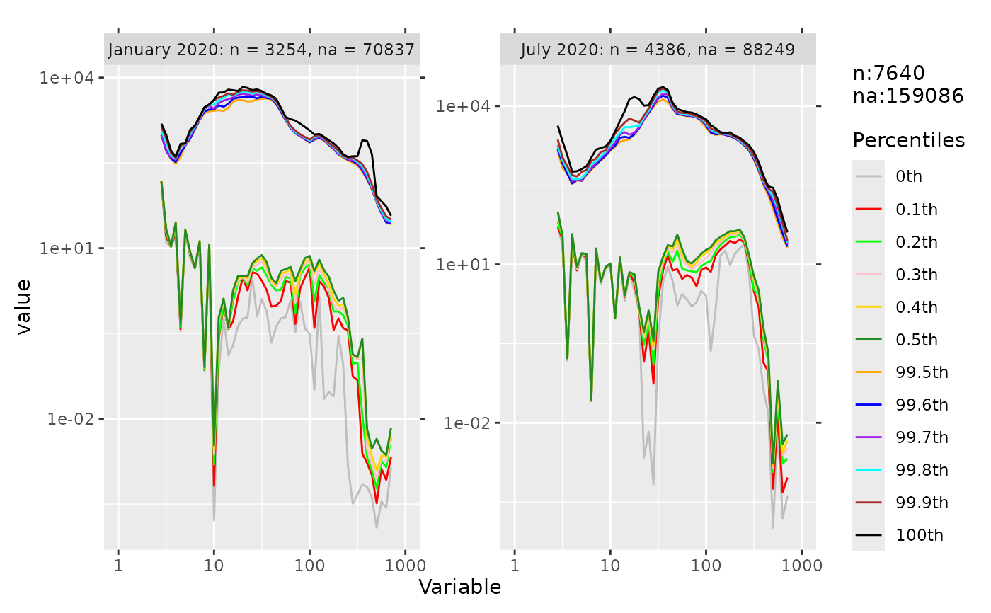 percplot(data, cols = 5:65, group = 4, num_xaxis = "numeric")
#> Warning: Removed 288 rows containing missing values or values outside the scale range
#> (`geom_line()`).
percplot(data, cols = 5:65, group = 4, num_xaxis = "numeric")
#> Warning: Removed 288 rows containing missing values or values outside the scale range
#> (`geom_line()`).